


I opened Kickstarter expecting a simple way to browse creative projects, but I found a more useful role for it: it works as a bridge between an idea that needs support and a community willing to help bring it forward. As a social app from Kickstarter PBC, it puts discovery, project details, pledging, and reward tracking in one mobile space. The app itself is free, although the projects you choose to support are separate financial commitments.
That distinction matters. This is not a shopping app where every item is already finished and ready to ship. It is a place where people present creative plans, explain what they want to make, set a funding goal, and invite backers to take part. In my experience, the most rewarding way to use it is to treat each project as a small decision-making process rather than a quick purchase.
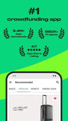
The app carries a Mature 17+ content rating, which is worth remembering if you are considering it for a younger user. It is available for free, has passed five million installs, and holds a 4.7 average from around sixty-six thousand ratings. Those figures suggest a well-established audience, but they do not remove the need to read each campaign carefully.
From a vague idea to a considered pledge
Starting with the right kind of project
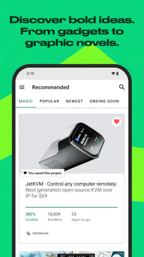
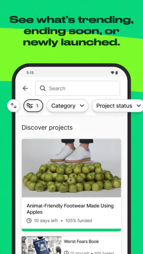
A realistic session often begins with a vague intention: I want to find an unusual book, a tabletop game, an album, a film, a design object, or another creative project that would not necessarily appear in a normal online store. Kickstarter is strongest at this discovery stage because the app exposes ideas while they are still being developed, rather than only showing finished products.
I usually begin by browsing categories and then narrowing my attention to projects with a clear explanation of what is being made. The first image may attract me, but it is rarely enough to justify support. I look for a campaign that explains the creative goal, the reward structure, and the practical path from funding to delivery. That habit saves time because an attractive presentation can still hide an unclear plan.
The social side of the app also changes how discovery feels. I am not just scrolling through products selected for immediate conversion. I am seeing pitches from creators who need people to understand the idea before deciding whether to participate. That makes the experience more personal, but it also means I have to do more evaluation than I would on a conventional retail platform.
Reading a campaign before spending
When a project catches my attention, I move slowly through its description instead of jumping directly to a reward. I check what the creator is promising, what stage the project appears to be in, and whether the reward makes sense for my reason for backing it. Sometimes the best choice is a modest pledge that supports the idea without making me depend on a particular physical item.
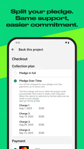
This is one of the app’s most important trade-offs. A pledge can feel like a purchase, but the underlying situation is different. The creator is trying to complete a project, and the final result may depend on production, shipping, materials, or other steps that are outside the app itself. I therefore see a campaign as a commitment to a creative process, not a guaranteed shortcut to a finished product.
A useful personal rule is to separate emotional excitement from practical confidence. I might love the concept immediately, but I still ask whether I would be comfortable waiting, receiving a different result than expected, or simply supporting the creator without treating the reward as essential. That question is more valuable than any single visual feature in the interface.
Choosing a reward without overcomplicating the decision
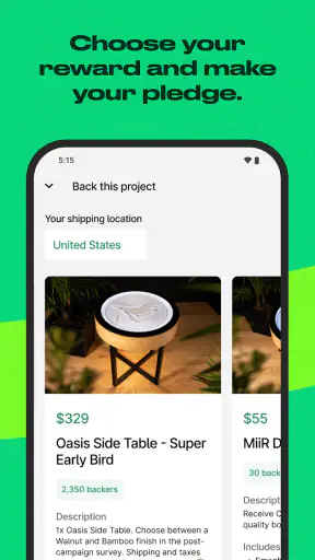
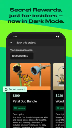
Reward tiers can make a campaign feel like a menu, with several ways to participate. I compare them by purpose rather than by apparent value. If I mainly want to help the project exist, the lower commitment may be the clearest option. If I genuinely want the promised item or experience, I examine what is included and whether the higher level adds something I would actually use.
One practical tip is to read the reward wording twice: once for what is included and again for what is implied. A photograph, concept image, or enthusiastic description can create expectations that the formal reward details do not support. I also pay attention to whether a reward seems aimed at collectors, early supporters, or ordinary users. The right tier depends on that difference.
The app makes this process convenient because I can investigate while away from a desktop computer. That convenience is helpful, but it can also encourage impulsive pledges. I prefer to save a project mentally, revisit its details, and decide after the initial excitement has cooled. The mobile format is excellent for discovery; it requires discipline for evaluation.
Following the project after the pledge
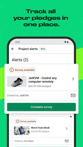
Once I support a campaign, my relationship with it changes. I am no longer just browsing. I want to know how the project develops, whether the creator communicates clearly, and whether the original idea is becoming something tangible. Kickstarter’s value here is not limited to the moment of payment; it keeps the project connected to the people who helped it move forward.
This creates a more involved experience than buying from a standard marketplace. A normal order usually moves from checkout to delivery with limited emotional investment. A Kickstarter project can make me feel part of the journey, especially when the creator shares progress or explains a change. That is satisfying when communication is thoughtful, but frustrating when the project becomes quiet or the outcome shifts.
I recommend checking project updates as part of a broader routine rather than constantly refreshing the app. A campaign is not a live chat, and frequent checking will not make production move faster. The better approach is to support projects that communicate in a way you can accept, then give the creator room to work.
Where the handoffs happen
The most interesting part of the workflow is the series of handoffs. A creator starts with an idea and turns it into a campaign. Kickstarter provides the environment where that campaign can be discovered and supported. Backers then decide whether the explanation is convincing enough to justify their participation. After funding, the creator has to turn public enthusiasm into a real result.
The app handles the connection between these stages, but it does not replace the creator’s work. That is why campaign quality matters so much. A polished presentation can introduce the idea, but the creator remains responsible for making progress. When I judge a project, I am really judging both the concept and the confidence I have in the person or team presenting it.
There is also a handoff between the app and the outside world. The mobile interface can show the campaign and keep me informed, but manufacturing, fulfillment, shipping, and final quality happen beyond the screen. This is the point where some users may feel disappointed: the app can make the process visible, yet it cannot make every practical problem disappear.
For that reason, I think of Kickstarter as a discovery and participation tool, not a conventional store replacement. It is better than a retail app when I want to find something original before it reaches the mainstream. A normal store is better when I need a predictable item, a clear delivery expectation, and an easy return-oriented buying experience.
A realistic everyday scenario
Imagine I am commuting home and remember that I want a new creative project to follow. I open the app, browse a few categories, and find a campaign for a product that matches my interests. Instead of pledging immediately, I read the creator’s explanation, inspect the reward choices, and decide whether I am supporting the idea or simply chasing a bargain.
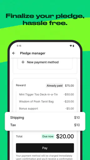
I choose a level that fits my actual interest, complete the pledge, and later return to see how the campaign develops. If the creator explains a change clearly, I can adjust my expectations. If I discover that the reward is not something I truly need, the decision still makes sense because my main goal was to help the project move forward. This is a healthier use of the app than treating every campaign like a limited-time shopping opportunity.
What the app does especially well
The strongest feature is the way it turns browsing into context. I do not just see an object; I see the idea behind it, the reason it exists, and the audience it is trying to reach. That makes the app particularly appealing to people who enjoy independent creativity and want to discover projects before they become widely available.
It is also useful for maintaining a personal stream of projects that matter to me. I can move from casual browsing to deeper reading without changing platforms. That continuity reduces friction and makes it easier to remain connected to a campaign after the initial pledge.
Another strength is the emotional clarity of the decision. On a large marketplace, thousands of similar products can make shopping feel interchangeable. Kickstarter often makes me ask a more meaningful question: do I want this project to exist? That question will not appeal to everyone, but for the right user it gives the app a distinct identity.
Where the flow breaks down
The biggest limitation is uncertainty. A campaign may sound convincing and still face delays or changes. I do not consider that uncertainty a flaw unique to the mobile app, but it is central to the experience. Anyone who needs a firm delivery date or a guaranteed finished product should probably choose a conventional retailer instead.
There is also a reading burden. To make a sensible decision, I need to spend time with the campaign rather than relying on a thumbnail and a short pitch. Users who want quick browsing, instant checkout, and minimal explanation may find Kickstarter slower than expected. The app rewards curiosity, but it does not remove the work of judging a project.
Reward selection can create its own confusion. A higher pledge may look attractive because it includes more, yet extra items are not automatically better. I have found it more useful to decide what outcome I want first and then select the simplest reward that matches it. This avoids turning support into an accidental collection of things I would not otherwise choose.
The handoff from creator to backer can also feel uneven. Some campaigns communicate in a way that builds trust, while others may leave me unsure about progress. That difference is not something a universal interface can fully solve. My practical advice is to treat communication style as part of the project’s quality, not as an optional extra.
Who should use it and who should skip it
I would recommend Kickstarter to people who like independent design, publishing, games, film, music, and other creative work; to curious shoppers who enjoy discovering ideas early; and to backers who understand that participation can involve patience. It is especially suitable for someone who wants their spending to support a project rather than simply acquire an immediately available item.
I would be more cautious recommending it to someone shopping under a strict deadline, someone who cannot tolerate changes to an order, or someone who expects every pledge to behave like a normal retail transaction. It is also not the best fit for a user who wants a purely passive social feed. The most satisfying experience requires reading, comparing, and accepting some responsibility for the decision.
Device details and everyday usability
The app was released on January 21, 2016, and the current version is 3.42.0. It supports devices running at least OS 8.1, which makes it accessible to many users who are not carrying the newest phone. I appreciate that the experience is designed for short visits as well as longer research sessions: I can discover a campaign quickly, then return later when I have enough attention to read it properly.
Since it is free to install, the initial barrier is low. The real cost begins only when I decide to back a project, so I treat installation and pledging as two separate choices. That makes the app easy to explore without committing money, which is exactly how I think it should be used.
My final take after following the full journey
Kickstarter works best when I approach it as a meeting point between creators and interested supporters. It takes me from discovery to research, from research to a considered pledge, and from that pledge to an ongoing connection with the project. The result can feel more personal than ordinary shopping because I am helping an idea take shape rather than selecting something already sitting on a warehouse shelf.
At the same time, the app cannot turn uncertainty into certainty. The campaign still depends on the creator, and the final handoff into production and delivery may be complicated. That is why my strongest recommendation is simple: back projects because you believe in them, and choose rewards only when you can accept the possibility that the journey may be slower or less predictable than a normal purchase.
For me, that balance makes Kickstarter worthwhile. It is not the right tool for every purchase, but it is a distinctive social app for finding creative work and deciding which ideas deserve support. If you enjoy being early, reading between the lines, and following a project from proposal to outcome, this is an app I would gladly keep on my phone.


